When it comes to landing page design, there are no real rules. However, there are a few essential elements that you should include if you want to create a high-converting landing page.
In our beginners guide to landing page optimisation, we’ll talk you through:
- What to include on your landing page
- How to choose a colour scheme and images
- What a good landing page looks like
- Why you need to provide a header and how to upload it
Remember, if you have any questions, get in touch with the partner support team who will be happy to help.
What to include on your landing page
The essential elements to consider and include on your landing page are:
- Registration form and log-in button
- Logo
- Imagery
- Colour scheme
- Member feed
The registration form is the most important part of your landing page. It’s essential that it’s the central focal point of the page and includes a clear ‘call to action’.
A call to action is a banner, button or piece of text that tells a user what to do next, for example; ‘Join now’, ‘Register’, or ‘Click here’.
How to choose a colour scheme and images
How your site looks really depends on the network that you set your site up on and the audience you’re targeting.
Think of your landing page as a book cover; as the potential buyer browses the many books on the shelf, the book they pick up is based on the cover catching their eye – the dating site that a consumer joins will be the one that catches their eye.
With that in mind, it’s important to make your landing page relevant to your audience. The imagery you choose should reflect that. If you’re creating a general dating site, then a picture of a happy couple would work well. If you’re creating a mature dating site targeting the over 50s, your landing page should feature a happy couple in that age bracket.
When choosing a colour scheme, keep the same goal in mind. The palette of the site should capture the visitor’s mood. For simplicity, most general and mature sites are light, neutral colours, whilst casual sites typically have a darker, fiery tone.
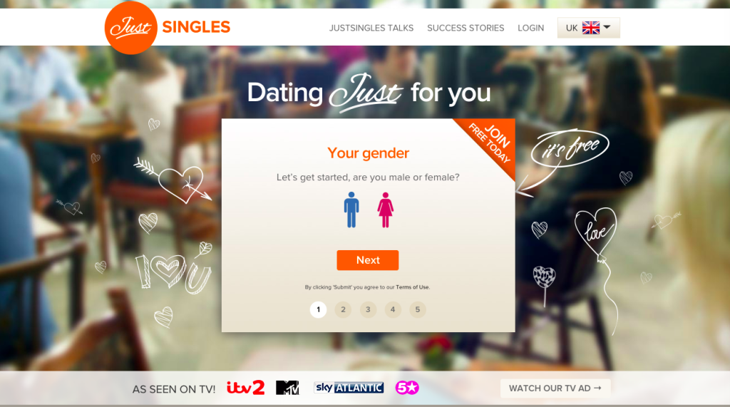
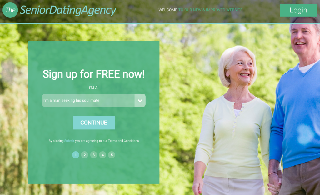
Good landing page examples
Here are a few examples of what your landing page should look like.
JustSingles.com
SeniorDatingAgency-UK.co.uk
WeLoveDates.com

Why you need to provide a header and how to upload one
A site header is a vital branding component, making your site unique and distinguishable from others on the White Label Dating platform.
You should use the same colours, fonts and images used on your landing page to provide your members with a seamless transition between your landing page and our app. Take the same approach with the “style sheet” and select colours that fit in with the rest of the site design.
Before your site can go live, you need to upload your headers and footers at steps three and four of the site creator process in the Partner Portal. These need to be in the following sizes:
- A site header/footer: 960 x 150 pixels
- An email header/footer: 760 x 150 pixels
You will also need to upload an additional logo to appear in your mobile header, which will appear on our fully responsive platform. This should be:
- A transparent PNG file
- In the dimensions 560 x 200 pixels
Please note: A header is compulsory, but a footer is optional. You can submit the same banner design for your site and email, but you will need to ensure the dimensions for each are correct. Alternatively, you could simply upload a logo that fits within each space.
You can host these images yourself. Or alternatively, we can host them on our server for you if you send the partner support team the necessary assets.
Whichever option you choose, you will need to include the snippet of code below. You should replace the below URL with the address where your image is hosted:
Any questions?
If you need any help with creating a landing page, get in touch with the partner support team today.