Our web designers, Nick and Steph, give their top tips for effective site design and achieving a high conversion rate.
1. Stand out from the crowd
 If your website and social media channels look the same as everyone else, you will inevitably blend in online. You want your website to stand out. Focus on your unique selling points in your page layout. Create a design that’s unique to you and use strong, stand-out branded elements to reinforce your brand at every opportunity.
2. Prioritise your content
While some people say that the fold no longer exists, it’s still essential that the most important components of your page are visible as soon as a visitor lands on the page if you want to achieve a good conversion rate.
Visitors should see your logo, a relevant image, a registration form and a strong call-to-action (CTA) as soon as they land on your page. You need to think about your core goal for the page – for any dating site, the goal will be to encourage new registrations. To help with this, remove any barriers to entry or work you expect the customer to do by making it quick and easy to sign up to your site.
3. Pick the right colours
 Colours have a real effect on people’s emotions, so selecting the right colours for your site could impact your conversion rates. Before selecting colours, consider the tastes and ages of your target audience. A senior dating site with a black background is unlikely to attract potential customers to sign up. But, experimenting with bright colours or pastel colours and a good contrast could help older web users to convert.
Call-to-actions (CTAs) typically have higher conversion rates when they are bright primary and secondary colours (red, green, orange, yellow) and will usually see a lower conversion rate if they are darker colours (black, dark grey, brown, purple). While using colours is commendable, be sure to avoid colour overload. Rather than confusing visitors with busy, colour-filled landing pages, don’t be afraid to utilise white space to direct visitors to your bright, primary coloured call-to-action.
4. Use a consistent palette
Whatever colour palette you select, successful website design is to ‘pick it and stick with it’! Consistency is everything when reinforcing a coherent identity across your site. The more distinctive your site branding is, the more comfortable customers will be with your website and product. You can always rebrand and change your site’s look if you’re not satisfied with it or A/B test other colour palettes; but if you do, just remember to be consistent.
5. Make your visual elements responsive
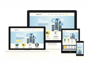 It’s best practice to make sure that your site is responsive to give all of your visitors a good on-site experience, whatever device they’re using. Responsive sites typically achieve better organic search rankings and and can also increase your conversion rates.
If you want to determine how your website looks across different devices, there are plenty of online tools you can use. If your site isn’t responsive then we’d recommend you address this by speaking to the partner team and utilising Google’s guide to mobile-friendly sites to help you get started.
If you need more advice on how to create an effective landing page to increase conversions, please speak to the Partner Manager team.