Landing Page Conversion Optimisation Blog Series – How we optimised our landing pages to improve core website performance metrics, boost our conversion rates (site visitor to registrations) and save on our acquisition costs. Part 1 – Level-Up Your Layouts.
Website Optimisation
Website optimisation is incredibly important for marketers and website owners. When you optimise your website and landing pages you’re making it easier for users (potential paying members) to sign up to your service (your dating site in this instance) – getting them one step closer to subscribing to a paid membership.
If users encounter a poor user experience (UX), barriers or distractions on your site they are likely to leave your page within the first few seconds. This negatively impacts your conversion rate and massively wastes your ad spend and marketing efforts.
This article is the first part in our newest blog series about how we optimised our landing pages to improve core website performance metrics, boost our conversion rates (site visitor to registrations) and save on our acquisition costs.
Level-Up Your Layouts
We optimised our page layout to focus on the right things
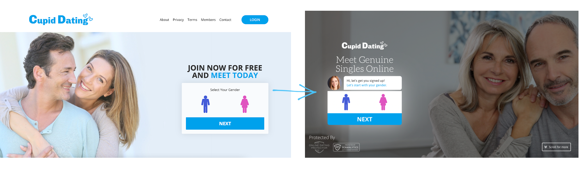
Reg Form Position
To ensure our page visitors found it easier to focus on the site elements that we wanted them to, we made some changes to where the registration forms sat on the page and how prominent they were. Take Cupid-Dating for example, we moved the registration form to the left side as users’ eyes naturally skim from left to right.
This, combined with the dark shading behind the above page fold area meant that the form was much more visible on the page and triggered action better than before. This resulted in a boost in click to registration (landing page conversion) rates.
Spread Out Content
Having a super crowded page can be very off-putting for a site user. Too much white space, is never a good idea, but utilising small amounts of white space and spreading out content makes a huge difference to how easy it is for a user to read your content – or whether they even bother to try in the first place.
Look at this example from Dating Agency. The site, prior to testing, had a large volume of text in one area. There was even more text covering images (which was also difficult to read due to the white on orange colour clash). To improve the UX we spread out the content and made sure the text colour be easily read against the background colours.

The Results
Website layout testing is extremely important and our recent results demonstrate why . As a result of our initial testing we have seen a huge +15% increase in the number of site visitors that are creating a free member profile (becoming a registration on our dating sites), as well as an impressive +10% saving in cost per lead (CPL) on Google Ads – the amount we are spending for each registration that comes via Google Ads.
These results have come solely from optimising our landing pages – not making any changes to our ads.
This means that more users are converting to members from our landing pages, which means our dating sites will achieve more upgrades, leading to increased revenues. If that isn’t the sign you were looking for to get started on your own website optimisations, I’m not sure what is.
Stayed tuned for our next article in this series where we will delve into the changes made to our landing page content and exactly how we optimised this.
Want some help? If you have any questions about anything mentioned above, or you would like support with your own landing page layouts, contact our partner support team directly here.