
Landing Page Goals and Strategy
A landing page is a single-purpose page designed to convert visitors into actions (signup, click through to dating offer, email capture).
Two Types of Landing Pages for Dating Offers
Type 1: Direct Conversion Page
- Visitor lands here, immediately exposed to dating platform
- Goal: Get visitor to click "Join" or "Sign Up" button
- Used with: Paid ads, organic search (high intent)
- Conversion rate: 2-4% cold traffic, 5-12% warm
Type 2: Warm-Up / Email Capture Page
- Visitor lands here, offered something valuable (lead magnet)
- Goal: Capture email address
- Visitor then added to email list
- Later emailed dating offers with warmer messaging
- Used with: Display ads, social media, low-intent traffic
- Email capture rate: 10-30%
Most successful campaigns use Type 2 for cold traffic (paid ads, social), Type 1 for warm traffic (email list, organic search).
Conversion Rate Benchmarks
| Traffic Type | Page Type | Typical Conversion |
|---|---|---|
| Organic search (high intent) | Direct conversion | 4-8% |
| Email list (warm) | Direct conversion | 8-15% |
| Google Ads | Direct conversion | 2-4% |
| Facebook cold | Warm-up/lead magnet | 10-25% email capture |
| Content/blog | Direct conversion | 2-5% |
| Push traffic | Direct conversion | 0.5-2% |
Headline Formulas That Convert
Your headline determines whether visitors read further or bounce. A/B test extensively here.
High-Converting Headline Patterns
Pattern 1: Benefit + Curiosity
- "Find Real Love (Without Downloading 10 Apps)"
- "Meet Compatible Singles (The AI Matching Way)"
- "Attract Higher-Quality Matches (Proven 3-Step Formula)"
Pattern 2: Specific Result
- "33% of Our Members Found Their Partner This Year"
- "Get 3x More Matches in 30 Days"
- "Over 1.2 Million Couples Met Here"
Pattern 3: Solve Specific Pain
- "Tired of Fake Profiles? Here's the Solution"
- "Why Your Dating Profile Isn't Working (And How to Fix It)"
- "Stop Wasting Time on Dead-End Matches"
Pattern 4: Exclusive Angle
- "The Premium Dating App Serious Singles Choose"
- "Join the #1 Rated App for Over-40 Dating"
- "Where Successful Professionals Find Love"
Pattern 5: Overcome Objection
- "Yes, Online Dating Actually Works (Here's Proof)"
- "Skeptical About Dating Apps? See These Results"
- "The Science Behind Why This Works"
Headline Length and Clarity
- Optimal length: 7-12 words
- Avoid: Jargon, unclear language, multiple benefits crammed in
- Test: Benefit-driven vs. curiosity-based headlines (both work, depends on audience)
Good headline: "Meet Compatible Singles Ready for a Real Relationship"
Bad headline: "Revolutionary AI-Powered Dating Experience Matches You Perfectly"
Above-the-Fold Elements
Above the fold is the visible area before scrolling. It's the most important real estate.
Essential Above-Fold Components
1. Headline (40% of fold height):
- Single, clear, benefit-focused statement
- Not overly clever or cute (serious dating seekers want real results)
- Tests best: 7-12 word benefit statement
2. Subheading (10% of fold height):
- Clarifies or expands on main headline
- Example: If headline is "Meet Your Match," subheading is "Join 3 million singles who found real connections"
3. Hero Image (40% of fold height):
- Single attractive couple or smiling individual
- Real photo (or looks realistic), not overly stock
- Professional, friendly tone
- Mobile: Simple image crops better than complex compositions
4. Primary CTA Button (5% of fold height):
- Contrasting color (orange, green, red on white background)
- Clear, actionable text: "Join for Free," "See My Matches," "Start Now"
- Large enough to tap on mobile (44x44px minimum)
5. Trust Signal (5% of fold height):
- "TrustPilot: 4.8/5 stars from 50k+ reviews"
- "As seen on: Forbes, Cosmopolitan, etc."
- Award badge
Visual Hierarchy
Use size, color, and position to guide attention:
- Headline (largest, darkest, top)
- Subheading (smaller, medium color)
- Primary CTA button (bright color, prominently placed)
- Hero image (large, right side if space permits)
- Trust signals (small, bottom)
Body Copy Structure
Below the fold is where you build conviction and overcome objections.
Body Copy Sections
Section 1: Opening Argument (2-3 sentences)
State the problem and your solution clearly:
"Finding love online feels impossible. Wrong profiles clutter your feed. Fake profiles waste your time. Real matches feel rare. [Dating Platform] is different."
Section 2: The Opportunity (3-4 sentences)
Explain why now is the time:
"Dating apps are how people meet now. 60% of couples who've been dating 1-3 years met online. If you're not on an app, you're excluding yourself from where people actually are. The sooner you start, the sooner you find your person."
Section 3: How It Works (4-6 bullet points)
List the process simply:
- "Create a profile (2 minutes)"
- "Add photos and write your bio (5 minutes)"
- "See compatible matches (instant)"
- "Message and connect (start conversations)"
- "Go on dates and find love (your goal)"
Section 4: Why This App Specifically (3-5 points)
Differentiation:
- "AI matching (not random swiping)"
- "Verified members (real people only)"
- "Privacy focused (your data stays private)"
- "Mobile first (use anywhere)"
Section 5: Social Proof Section (varied)
This gets its own section below.
Section 6: Objection Handling (3-4 short paragraphs)
Address common concerns:
"Is it really free? Yes, creating a profile and browsing is completely free. Premium features are optional."
"How long do matches actually respond? Our data shows 73% of users respond to messages within 24 hours."
"Will I find someone my age/type? Our AI learns your preferences and only shows matches most likely to be compatible."
Section 7: Final CTA and Risk Reversal (2-3 sentences)
Strong closing:
"Join thousands of singles finding real connections on [Platform]. Try free today. No credit card required. If you don't see matches you like in your first week, delete your profile instantly."
Tone and Language
- Dating page tone: Hopeful, warm, authentic (not salesy)
- Avoid: Corporate jargon, overpromise, manipulation tactics
- Use: Conversational language, specific examples, genuine benefit statements
Example (avoid): "Experience revolutionary digital romantic interface engineering"
Example (good): "See matches made for you, not random swiping"
Social Proof and Trust Building
Social proof is credibility. It reduces friction and increases conversion 20-40%.
Types of Social Proof
1. User Reviews and Testimonials
Include 2-3 short reviews:
"I never thought I'd meet someone online. But I did, and we've been together 2 years. Thank you." - Michelle, 35
"Best dating app I've used. Real people, genuine matches. Recommend it." - James, 42
Key elements:
- Include name and age (increases believability)
- Keep to 1-2 sentences
- Photo optional (but adds credibility)
- Avoid overly polished testimonials (they seem fake)
2. User Count and Social Proof Numbers
"3 million+ active members" (quantifies scale)
"1 new couple meets every 10 minutes" (implies success rate)
"4.8/5 stars from 50,000+ reviews" (aggregate credibility)
"#1 rated dating app for professionals" (authority claim)
3. Media Mentions
"As seen in: Forbes, Cosmopolitan, Bloomberg, The New York Times"
Use small logos of major publications (if legitimately featured).
4. Awards and Certifications
"Best Dating App 2024" "AppStore Editor's Choice" "Verified by [Privacy/Safety Org]"
Placement of Social Proof
Above the fold: Highest-impact proof only (1-2 user review snippets, star rating)
Middle of page: User testimonials section with 3-5 reviews
Near CTA: "Join 3 million+ singles" (reminder of scale before signup)
Credibility Gaps to Avoid
- No reviews: Adds friction. Include at least one short review.
- Generic reviews: "This app is amazing!" reads as fake. Specific details = credibility.
- Old reviews: If featured review is from 2020, seems outdated. Refresh quarterly.
- No user count: "Millions of users" without specifics is vague. Use real numbers.
Call-to-Action and Form Design
CTAs and forms are where conversions happen or don't.
CTA Button Best Practices
Color: High contrast to background
- White background: Orange, green, or red buttons work best
- Contrast ratio: At least 4.5:1 (accessibility standard)
Text: Clear, action-oriented
- "Join Free" (weak, unclear what happens)
- "Create My Profile" (strong, specific)
- "See My Matches" (strong, benefit-focused)
Size: Large enough to tap
- Desktop: 180x50px minimum
- Mobile: 44x44px minimum
Position: Primary CTA appears every 200-300px of vertical scroll
- Above the fold (1x)
- Mid-page (1x)
- Bottom of page (1x)
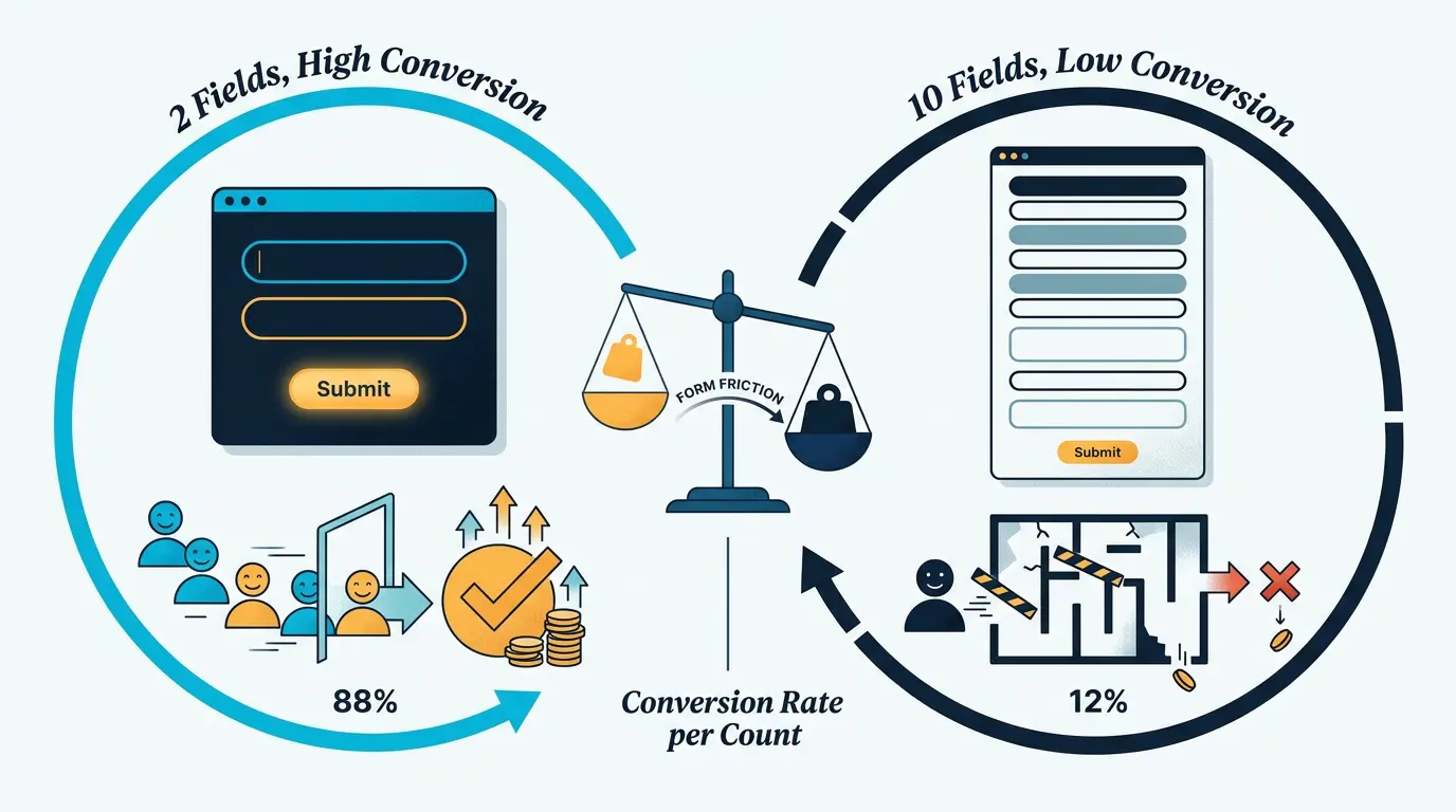
Form Fields: Less is More
More form fields = fewer conversions.
Minimum viable form:
- Email address only
- Continue button leads to dating app signup page (they fill out rest on-app)
Conversion: 15-20%
Standard form:
- First name
- Age/Date of birth
- Looking for (Male/Female/Other)
Conversion: 8-12%
Full form:
- Email, First name, Last name, Age, Looking for, Location, Interests
- Conversion: 2-5%
Rule: Every additional field reduces conversion by 5-10%.
Form Layout
- Single column (mobile-friendly): Best conversion
- Two columns (desktop): Works on desktop, bad on mobile
- Multiple pages (progressive profiling): Better for warm traffic, worse for cold
Form Labels
- Clear labels: "What's your email?" is better than "Email"
- Placeholder text: "name@example.com" helps users understand format
- Error messages: "Email is required" is clearer than "Error"
Form Styling
- Input fields: White background, clear border, padding
- Labels: Above or inside input fields (above is more accessible)
- Required indicator: Red asterisk or bold "Required"
- Focus state: Highlight selected field (blue border on focus)
Mobile Optimization
Over 60% of dating traffic is mobile. Desktop-only pages leave money on the table.
!High-converting landing page examples and templates *Examples of high-converting dating landing page layouts, headlines, and conversion optimization strategies*
Mobile Checklist
Layout:
- Single column only (no multi-column on mobile)
- Full-width elements
- Proper spacing between elements (not cramped)
Typography:
- Minimum font size 16px (prevents mobile zoom)
- Line height 1.5x (readability)
- Readable on small screens (not tiny text)
Images:
- Responsive (scale to screen size)
- Optimized (compress; <100kb per image)
- Alt text (accessibility)
Forms:
- Input fields: Full width, minimum 44px height
- CTA button: Full width, minimum 44px height
- Single column only
Speed:
- Test with Google PageSpeed Insights
- Aim for >90 mobile speed score
- Page load <3 seconds
Mobile-Specific Design
- Vertical headline: Single-line headlines (not multi-line)
- Hero image: Crops to phone aspect ratio (vertical)
- Buttons: Full-width, stacked vertically
- Navigation: Hamburger menu (hidden nav)
Page Speed and Technical
Fast pages convert better. Slow pages lose 50%+ of traffic due to abandonment.
Page Speed Benchmarks
- Good: 2-3 seconds load time
- Acceptable: 3-5 seconds
- Poor: 5+ seconds (expect 50%+ bounce rate)
Optimization Techniques
Image optimization:
- Compress images (use TinyPNG, ImageOptim)
- Serve appropriate size for device (responsive images)
- Use modern formats (WebP instead of JPG/PNG)
- Lazy load images below fold
Code optimization:
- Minimize CSS and JavaScript
- Remove unused code
- Defer non-critical scripts
Hosting:
- Use fast hosting provider (not shared hosting)
- Use CDN (content delivery network) to serve from locations close to users
- Enable caching
Tools:
- Google PageSpeed Insights: Identify issues
- GTmetrix: Performance report
- WebPageTest: Detailed breakdown
Technical SEO (for organic search traffic)
- Meta title and description: Appear in search results, influence CTR
- Heading structure: H1 (one per page), H2/H3 for sections
- Alt text on images: Helps search engines and accessibility
- Mobile-responsive: Google prioritizes mobile-friendly pages
- HTTPS: Security signal (required for forms)
A/B Testing Framework
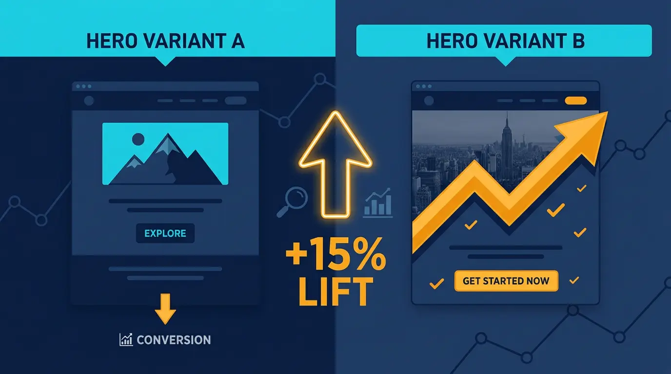
A/B testing is how you optimize from 2% to 5-8% conversion.
What to A/B Test (Priority Order)
Priority 1: Headline (biggest impact, 10-30% lift)
- Test benefit-driven vs. curiosity-gap
- Test specific number vs. general claim
- Example tests:
- "Find Real Love Online" vs. "Meet 3 Million+ Singles"
- "No Fake Profiles, No Games" vs. "Your Match is Waiting"
Priority 2: CTA Button Text (5-15% lift)
- "Join Free" vs. "Create My Profile" vs. "See My Matches"
- "Get Started" vs. "Start Matching Now"
Priority 3: Form Fields (5-20% lift)
- Single field (email only) vs. three fields (email, name, age)
- With vs. without phone number
Priority 4: CTA Button Color (5-10% lift)
- Red vs. Orange vs. Green vs. Blue
Priority 5: Social Proof Placement and Content (3-8% lift)
- Testimonials above fold vs. middle vs. below
- User count display vs. success rate display
A/B Testing Process
Step 1: Create hypothesis "Changing CTA text from 'Join Free' to 'See My Matches' will increase conversions because it's more specific/benefit-focused."
Step 2: Create variant Keep everything identical except the element you're testing.
Step 3: Run test
- Direct 50% of traffic to control
- Direct 50% of traffic to variant
- Run for minimum 1 week or 100 conversions (whichever takes longer)
Step 4: Analyze results
- Control: 100 visitors, 3 conversions = 3% conversion
- Variant: 100 visitors, 4 conversions = 4% conversion
- Improvement: 33% (relative), 1 percentage point (absolute)
Use statistical significance calculator to confirm it's not random chance.
Step 5: Implement winner If variant wins and reaches statistical significance (95% confidence), make it the new control.
Common Testing Mistakes
- Too many variables: Only test one element at a time
- Running test too short: Need minimum 100 conversions per variation
- Running test too long: Once winner is clear at 95% significance, stop and implement
- Not documenting results: Keep testing log (what worked, what didn't)
Realistic Timeline and Improvements
Month 1 baseline:
- Conversion: 2%
- 100 visitors = 2 conversions
Month 2 (5 headlines tested):
- Best control: 3% conversion
- Improvement: 50%
Month 3 (3 form variations tested):
- Best: 4% conversion
- Improvement: 33%
Month 4 (CTA button text, social proof placement):
- Best: 4.5% conversion
- Improvement: 12.5%
Result: Started 2%, after 3 months testing reached 4.5% (125% improvement). Small wins compound.
Dating Landing Page Examples
Example 1: High-Converting Lead Magnet Page
Purpose: Email capture from cold Facebook traffic
Above fold:
- Headline: "The 3 Dating Profile Mistakes Costing You 80% of Potential Matches"
- Subheading: "Free guide reveals the exact changes to make"
- Hero image: Attractive couple smiling
- CTA: "Get My Free Guide" (orange button, full width on mobile)
- Trust signal: "4.8/5 stars from 47k+ reviews on TrustPilot"
Body:
- Problem statement: "Most people on dating apps don't get any matches. Why? Because their profile kills their chances before anyone even reads their bio."
- Solution tease: "A simple 3-part framework fixes your profile forever"
- Benefit: "Members who implement these 3 changes get 3x more matches in 2 weeks"
- Social proof: 2-3 testimonials from people who improved profiles
- CTA: "Yes, I want the free guide" (repeat button)
Form:
- Email only
- Clear value: "Instant download, no spam"
Expected conversion: 15-25% email capture rate
Example 2: Direct Conversion Page (High Intent)
Purpose: Convert from organic search ("best dating apps for over 40")
Above fold:
- Headline: "Meet 750,000+ Singles Over 40 Ready for Real Relationships"
- Subheading: "Join the #1 dating app for mature singles"
- Hero image: Attractive 40+ couple
- Primary CTA: "Join for Free" (bright green button)
- Trust signal: "#1 app for 40+ dating, 4.9/5 stars"
Body:
- Why this matters: "Dating after 40 is different. You know what you want. You want real connection, not games. Most dating apps are full of young people. Ageism is real. Here's where mature singles actually meet."
- How it works: 5-step process (simple)
- Why this app: "AI matching learns your preferences," "Verified members only," "Safety features most important," "Simple interface (not overwhelming)"
- Success stories: 3 testimonials from people 40-60 who found partners
- Objection handling: "Is it really free?" "How many members in my area?" "Will people respond?"
- CTA: "Start matching free" (repeat)
Form:
- Email + age + looking for (3 fields)
- Then redirects to app signup
Expected conversion: 4-8% (warm search traffic)
Key Takeaways
- Landing pages are the bridge between traffic and conversions. Optimizing page is as important as driving traffic
- Use benefit-focused headlines (7-12 words) that speak directly to visitor intent
- Include social proof above the fold (reviews, user count, awards) to reduce friction
- Keep above-fold clean and focused: headline, image, CTA, trust signal. Nothing else.
- Body copy follows formula: problem statement, solution, how it works, why this app, social proof, objection handling, final CTA
- Mobile optimization is non-negotiable. Over 60% of dating traffic is mobile. Full-width, single column, fast load.
- Minimize form fields. Email only = 20% conversion; each additional field = 5-10% drop
- Test in this priority order: headlines (10-30% impact), CTA text (5-15%), form fields (5-20%), button color (5-10%)
- Realistic conversion rates: 2-4% cold traffic, 5-12% warm traffic, 15-25% lead magnets
- Build email list from every page. Email is owned media that compounds over time
Beyond Landing Pages
After you've optimized your landing page, learn how to drive traffic to it through paid ads or organic SEO. You should also explore how to build dating comparison sites that house multiple landing pages. And once you have email lists from your pages, master email marketing strategy to convert those captured leads into revenue.
- Monitor page speed. Pages over 5 seconds lose 50%+ of traffic to abandonment
- Avoid overpromising or misleading claims. Compliance violations get you banned
Grab tested DatingPartners landers in your affiliate dashboard. No design team needed.
Visit DatingPartners.com →