The most effective way to optimise for mobile is by implementing a responsive website design. A responsive design is one that adapts to the screen it is being used on, regardless of device and screen size.
Here’s a reminder of the benefits of a responsive website design and why you should build one:
Better user experience
A responsive design automatically reformats and adjusts to the device you’re using. This provides a fluid user experience with less scrolling and resizing. For the user this means that the content on the page is easier to find and call to action’s are be more visible, providing a better user experience.
Better for SEO
Last year, Google announced that they would be giving preferential treatment to ‘mobile friendly’ sites. Therefore, not only will a responsive web design improve the user experience, it can can also contribute to a higher PageRank.
Benefits your brand
Research shows that 75% of users admit to making judgments about a company’s credibility based on their website design. By ensuring your designs are optimised for mobile, users are more likely to have better experiences on your site. This is likely to lead to positive associations with your brand. That’s why it’s essential to ensure that all designs are responsive if you want to remain competitive.
Reduce your bounce rate and increase your conversion rate
A mobile optimised site is much easier to navigate, meaning users are likely to spend more time on it if the content is clearly visible. Therefore, a responsive design could decrease your bounce rate as users will spend more time browsing on your site. It could also increase your conversion rate as a knock on effect of providing a better user experience and users spending more time on your site.
While they can be highly effective, responsive designs can be expensive. If you don’t have the funds to build a custom responsive designed landing page at the moment, we’d recommend using our WALDO site creator tool to build fully optimised landing pages.
The WALDO site creation tool has several responsive and high performing landing page templates that you can implement on your site. Using these templates can save you significant costs on design and development while still providing a better user experience by having a responsive design.
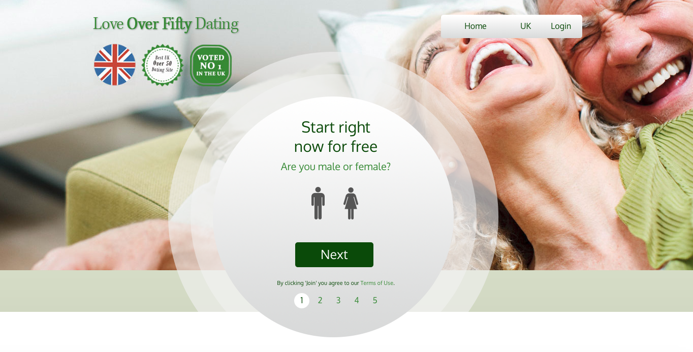
Here are some examples of responsive landing pages that have been built using the templates available in our WALDO site creator tool:
- Professional Singles Group
- Love over Fifty Dating
- Latino Dating Now
- Local Dating USA
- Hampshire Singles
For more information about using the WALDO site creator tool, get in touch with your Partner Manager.